Since I settled in the French capital, I’ve always been curious to know what other Parisians were doing. Part FOMO, part simple desire to discover cool places.
SEO articles recommending the same touristy spots get old quickly. The Snapmap is not very relevant (anymore?), while other social networks give quite a peacemeal view of what’s going on: don’t expect to hear about a Porte de Versailles conference on a day of protests at République.
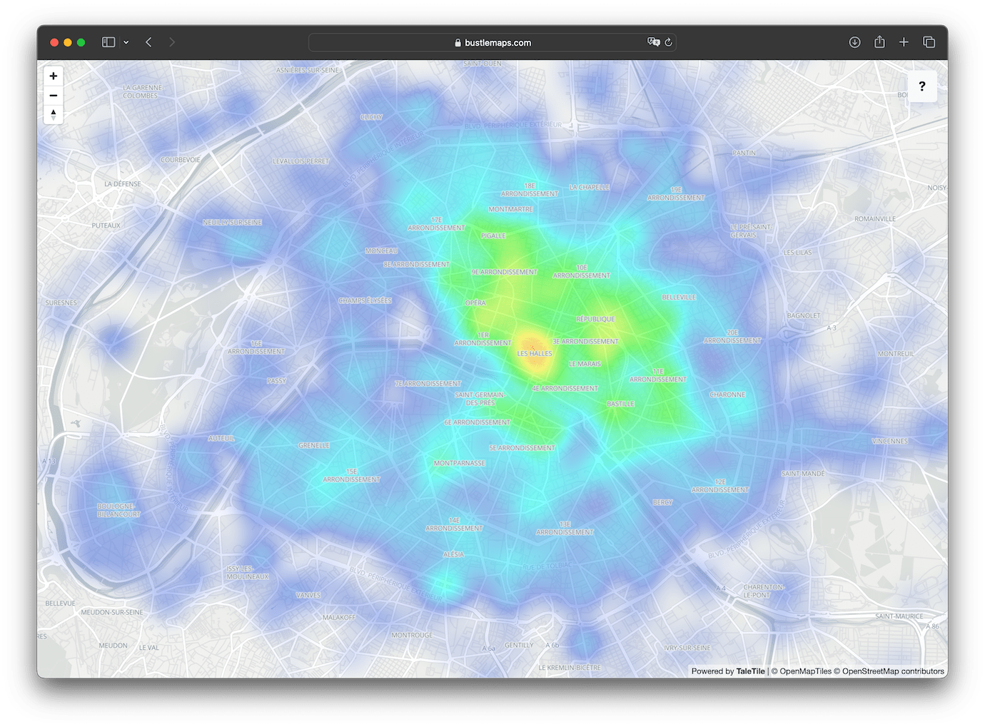
So I decided to build my own map using Open Data: here’s BustleMaps 🎉 Updated every minute and accessible from your own browser, it makes you feel the heartbeat of Paris at a glance.
How it works
Smoove, which operates the Velib' bike-sharing service, offers a public API that indicates in near real-time the number of bikes available at each station.
Velib' handles more than 100,000 rides a day on average, between the 1,447 stations in its network. Probably enough to get an idea of what’s going on in the city.
By comparing the number of bikes available in a given station from one minute to the next, we can approximate how many bikes have been taken or returned. Doing so for all stations and accumulating the results over 30-minute windows gets us everything we need to build a pretty heatmap!
The algorithm is written in Python and runs on an AWS Lambda, triggered every minute by an EventBridge rule. The data is stored in an S3 bucket, and the map is displayed on the client side with MapLibre GL JS.
Limitations
This is an approximation, biased towards transportation and skewed by some uses of Velib', such as intermodality (bike + train, for example, which boosts areas around train stations at rush hour). From a sociological point of view, it is centered on cyclists who use Velib', so quite far from representing the entire population.
The map would probably be much more interesting with data from Google Maps or CityMapper, or those collected by a data broker for advertising targeting or even those contained in the HLR of a major mobile carrier. But these are very valuable datasets, which are therefore not available.
Bike rebalancing operations across stations bias the figures: a station being refilled gives the impression that the area is more lively than in reality. Algorithmic adjustments limit the impact but do not completely curb it.
The number of slots in a station is limited: if a station is full, cyclists cannot stop there, which suggests that the area is less frequented than it really is. Some code partially corrects the problem, and we can assume that these trips end at other nearby stations.
The future
A few ideas for further development:
- Display daily timelapses
- Allow to consult the map at a specific point in the past
- Add other data sources to reduce bias and better detect areas of high activity
- Add other cities in France and around the world
In the meantime, I have walks to do :-)